Font geeks. Typography nuts. Being picky and choosy about fonts used to be the domain of tech users, probably only those with the latest and most expensive Apple computers.
I only became a “font geek” – technically a typophile or typomanic – in the last few years. But, I think if you aren’t a font geek, you at least need one on your team. It’s becoming a digital differentiator.
Why all the fuss about fonts?
I’ve talked about fonts several times on the blog before – it’s one of the biggest influences of a ‘masculine vs feminine‘ web design. It is part of your logo, which is part of your overall brand. Font choice ranks number one on the list, along with color, in terms of influencing the experience a customer has on your website. It’s the only thing that trumps language in the digital marketing space, in my opinion.
But don’t take my word for it. The Week shares a number of studies on how changing the font affects the experience in weird and sometimes not-so-wonderful ways. And I quote:
“Words hold power. But the aesthetic manner in which those words are presented can affect the way we read, and the way we think about the information presented.”
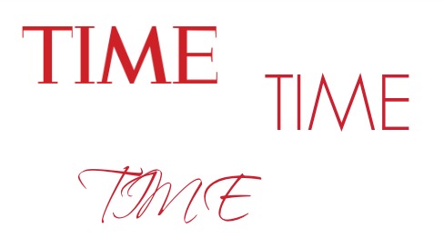
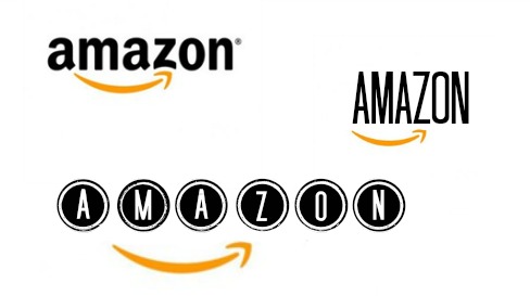
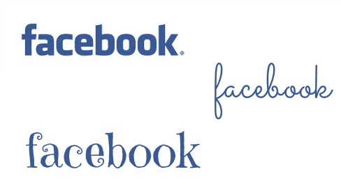
What do you think of these examples?
Let me demonstrate by example. The only things I changed in this examples was the font. How do you think it changes your perception of the brand or site displayed?
The Takeaway
You don’t really need to be a font geek if you have one on your team – but if your website or digital marketing materials are falling flat, ask yourself: do you have a font problem?
It’s one of those things that is easy to overlook, and it’s hard for a customer to point out as their actual complaint, but for many businesses, it’s a silent sales killer.
If you want to talk about your fonts, a red pen review is a great way to do that – I can’t possibly address all the scenarios here. I hope simply by reading this, you’ll now be more aware of the impact that font choice can have on all of your marketing materials.