I’ve been following the rollout of American Airline’s new branding – and the subsequent “outrage” via social media – with a great deal of interest.
American follows a long list of brands, from Gap to the University of California, who have deal with the ever-increasing blare of today’s consumer. The social economics of that trend are a story for another day, but this logo refresh stuff is pretty interesting.
Since it’s impossible to please everyone, does having a great logo even matter anymore?
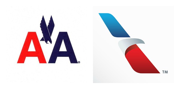
The old, and the new. Does it even matter?
A Reminder: The Purpose of a Logo (on the Web)
About 25% of my website critiques are done in the middle of a project, which gives me an opportunity to help shift the direction of a rebrand or site upgrade to incorporate as much best practice as possible.
I can’t tell you how many times I’ve had the “logo discussion.” The Wikipedia definition of a logo is “a graphic mark or emblem commonly used… to aid and promote instant public recognition.” My definition is short and sweet: a logo is a communication aid.
Logos help provide some brand awareness, and if you’re really clever, you can even incorporate part of your story into the logo. However, no matter how cool your logo will be, most of your logo’s creative genius will be lost on even your most devote customers. Even though it’s been widely reported, most people I’ve talked to don’t even know about the hidden feature in Fedex’s logo. See it?
![]()
Getting Your Website’s Visual Priories in Order
I make it pretty clear to my clients that the most important thing on a website is language. Language matters, and if your website’s copy sucks, a great design and fancy pants logo cannot overcome that.
When it comes to a website’s visuals, here’s the priority:
- Typography: Your font choices can communicate quite a lot in terms of a brand “feeling.” Choose fonts that are easy to read.
- Colors: Choose wisely as colors are important, but don’t overengineer this – the world of ‘color psychology’ and its impact on website conversions is very complex. Keep it simple. (For illustration: you don’t pick UPS over Fedex because you like their brown versus Fedex orange, right? Didn’t think so.)
- Logos and other Visual Aids: Logos are a visual aid that helps drive brand awareness/remembrance, but your business probably has lots of other visual aids. Do you sign your blog posts with a signature? Does your product’s packaging have a particular look? Some other flourish that helps you stand out?
I’m actually at the tail-end (pun intended, ha) of a major rebranding project myself, so these topics are all quite top of mind. I am an advocate of freshening up your branding when it makes sense, and I also encourage you to have a clear brand strategy that applies to all aspects of your marketing – your website, your packaging, your business cards, etc. should all align.
And, people hate change, so no matter what you decide to do in the future, somebody probably will hate it.
Welcome to owning a brand and a business.