I’ve been listening to your feedback about my website critique offering, and many of you have asked for something a bit simpler and more lightweight. So, for the month of June only, I am experimenting with a new service: the red pen review.

Why do you need a red pen review?
The red pen review is something of a ‘mini’ website critique – quick, actionable feedback in spoonful-sized doses. If the summer is your busy season and you need to get your act together, or you hope to kick back and let your website do the work for you while you’re at the beach, you need a red pen review right now.
I’m still offering the full, in-depth website critique, but the red pen review will be focused only on 1-2 pages of your website max. For most businesses, you probably only have a handful of pages that are your “money” pages – the page layouts where revenue & engagement are happening.
The red pen review is also great if you’ve got a site redesign in the pipeline and want some feedback on design mockups before implementing them.
Andy is a true professional, and so knowledgeable about the latest website technology, design, and optimization strategies. He has really helped me determine what I want to accomplished with my site, and the best, most creatives ways to make it all happen – and he is a lot of fun to work with!
-Heather George, DiveTheTropics.com
What does a red pen review look like? Is there really a red pen?
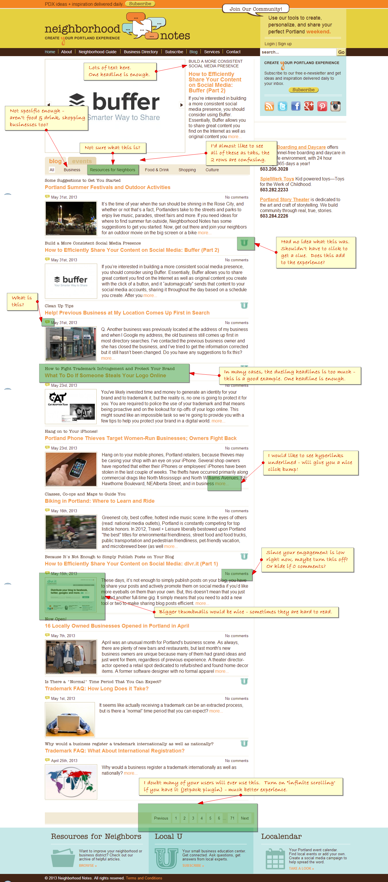
Everything is digital here, folks, but yes, I am happy to use red font, just to stay “on brand.” I asked one of my clients, Neighborhood Notes, if I could share a red pen review session with you, and they happily agreed! We’ve been doing a lot work on their site, and this page was up next, so here is a sneak peek:

Thanks, Ken & Lynette, for letting us peek behind the curtains! Here’s what Lynette had to say about our work:
Thanks so much for the help and inspiration! After our chat, I trucked it right on over to my neighborhood art supply store, picked up a sketch book and then explored some creative possibilities for the site. I’m already smitten by one idea in particular—more on that when it’s fully fleshed out.
Squee! Feels good to be inspired. 🙂
What kind of results one expect from a red pen review?
I cannot promise you any specific result, because every review is different. But here are two examples from some website critiques in May:
- Renaming of an unclear menu item and clearing out clutter led to a $5,000 client sale three days after making site changes. (That is approx. a 900% return on investment, friends.)
- Changes to header design resulted in a 15% drop in bounce rate and corresponding 12% increase in newsletter signups. Yay for change!
Your mileage will vary.
What’s the difference between the website critique and the red pen review?
The difference between the website critique and the red pen review is that with the red pen, we’ll be focusing specifically on the shortlist of items that will have the biggest impact. The downsides with the red pen review are that we will not cover everything about your site, and there is no followup call to discuss.
However, the upsides with the red pen review is that there is less chance of getting overwhelmed or stuck moving forward, and you’ll have no excuse to get everything tidied up before summer.
Why should you get a red pen review versus just getting some feedback from a site like UserTesting or run a customer survey?
You could do those things. In fact, I would encourage you to do them. However, the problem with most feedback surveys is that you get feedback that you don’t know what to do with. With a red pen review, I’ll be giving you best practice feedback and specific suggestions on what the heck to actually do next, based on my 15 years of industry experience.
Cool! How much is it? Where do I signup?
The red pen review is $99 for up to two pages of your website.
(If you want to have me red pen more than that, email me: andy [at] andyhayes.com. If it’s more than 5 pages, you are better off getting the full website critique)
All you need to do is click the pretty button below, which will take you to a checkout screen where you can pay either via Paypal or via credit card. Then you’ll be brought back here to my site where I’ll give you the instructions for us to get started. I will then have your red pen review back to you within less than a week – sooner, if I can.
~~ OOPS. This offer is no longer available. If you need a site review, take a look at my website critique. ~~
Andy is one of those rare people who can be extremely warm and personal while, at the same time, maintain a standard of professionalism any business would benefit from. If you are looking for ways to improve your business website’s performance, conversions and organization, Andy is your man! I’ve had the pleasure of working with him on several projects and hope the sparks never end. I cannot recommend him highly enough.
– Jenny B Bones, Copywriter & Consultant, UpYourImpactFactor.com
A BIG thanks to Andy who is not only wise, but generous with it – and *really* knows his stuff. His tips were simple, straightforward, and easy for us to understand and implement.
Marketing genius!
– Julie Gibbons, Peoplemaps.com
Have questions before we get started? Email me: andy @ andyhayes.com.