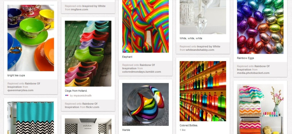
In the past week, Facebook has released a major newsfeed change that makes photos much bigger and a more streamlined interface that looks, well, more like Pinterest. Google Plus? Same thing pretty much. Oh, yes, eBay is now also on the Pinterest bandwagon.
Even Pinterest is releasing a new look so they can look more like Pinterest.
With all the Pinterest-y looks, I am not surprised my inbox has been filled with questions, like should I make my website look more like Pinterest?
Uhm, let’s unravel that a bit.

Pinterest. It sure is pretty to look at!
Why Designers Are in Love with Pinterest
While Pinterest is indeed the web’s current social media ‘darling,’ that isn’t the reason why web designers are drooling over Pinterest. They’re in love with the way that the site has really streamlined and simplified the social web experience so that busy, time-strapped folks are actually finding time to engage.
I work with many upscale & luxury brands; they’re all saying the same thing: the Pinterest experience is reaching an audience that was just difficult next to impossible to reach before.
It doesn’t take a genius to take a look around Pinterest and say, wow – this is easy to use. It also doesn’t take long to find shortcomings in the site’s design, but you can sacrifice a lot if people are using the site and don’t need all the fluff.
What you can learn from Pinterest
I don’t want you to redesign your site to look like Pinterest. Unless you’re a social network looking to compete with Pinterest, which I wouldn’t advise you to do either.
But you can take away some seriously good lessons about site design from those folks pinning away on their Pinterest boards. You bet that in my recent brand overhaul, we were all looking at Pinterest for inspiration.
- Our culture is moving towards a visual language. I had a conversation with my friend Kelly Kingman a couple of years ago. She’s a visual note-taker who told me that our culture is rapidly moving towards “visual” communication, and guess what — it is here. Take a look at this pin from Betty Crocker. Go on, I’ll wait. Back? Ok, see how it took your brain about 2 seconds to process the entire thing. The only text on the image is the name of the recipe. If you were good at guessing how much salt and flour the recipe called for, you wouldn’t even need the instructions. Forget the infographics, this kind of stuff is gold. If nothing else, get more, bigger, more useful photos on your site. Now.
- Simplicity is king. So many sites overnengineer everything. It’s easy to do – I’ve caught myself doing it too. Put on your spring cleaning hat: how can you use less text, less menu options, less product choices, less product configurations, and yet still communicate everything effectively? (I’m telling you – you’ve got something on your site you are explaining too much!) For example, on Plum Deluxe we changed the main navigation bar to simply be our editorial areas – Travel, Food, Home, etc. The result? Engagement through the roof – hard to calculate this number exactly, but I’d say it’s somewhere around 400% increase. Yes, really.
How is Pinterest inspiring the way you design, and more importantly, communicate? You don’t have to love, or use, Pinterest, but you can’t ignore it’s impact. Let me know if I can help.