A lot of my web producer projects lately have dealt with the topic of gender in web design. Does masculine versus feminine matter when comes to building your website?
In my professional opinion, it’s complicated. Let’s talk it through.
First, the Psychology of Gender in Web Marketing
The impacts of gender in marketing have been well studied for several decades; to save you the trouble of reading through all the research, the basic summary is that men’s brains look for cognition and understanding first; women’s brains look for emotional connection first. (Not to play into typical stereotypes, but if you’ve ever went grocery shopping with someone of the opposite gender who has a totally different shopping style to you, you can probably empathize with the above.)
What does this all mean when it comes to the web? Not much, if you consider the research of Meyers-Levy and Maheswaran (1991), who found that both men and women, despite their differences in brain processing, tend to lean heavily on nonverbal stimuli – e.g. pictures – in their buying decisions. Ever bought a bottle of wine based just on the label? (You don’t have to tell me – I know it’s true.) Ever decided not to book a hotel or eat a restaurant because something about the site just felt ‘off’ and you couldn’t put your finger on it? Mmmhmmm.
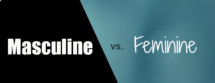
Website Elements that Have a Gender Bias
Ok, so what are these elements that provide a “gender” feel to a website? The top three, in order:
- Fonts: typography can definitely give a site a masculine or feminine feel. Out of anything, I think font choices have the biggest impact on the feel of a website – masculine/feminine, budget/luxury, simple/high-tech.
- Color: colors are second only to fonts when it comes to a site’s feel. Color theory in site design is very complex, but very real.
- Images: having images is crucial in today’s web marketplace – no surprise to you, I’m sure. But what those images are can transform a site feel.
How do you incorporate gender stereotypes in your approach?
You’re probably wondering what the heck all this means for your website now. Take a deep breath – for the majority of you, simply being aware of the gender bias is enough to make better choices for your site. For example, if you’re a wedding planner, you probably know the bride is the one who often chooses the planner, so a feminine-friendly approach is good. Selling golf vacations for dudes? You might want to err on the side of masculine.
But for the majority of businesses, taking a fairly gender-neutral approach is just fine. I’m working right now with a female consultant who tells me most of her clients are males. Alpha males, she says. So should she have a feminine site, since the site is quite personable, or masculine site, since her clients are masculine? Now, before you answer, what if I said she wants to work with more women? Or she’s bringing on a male business partner? Ha! Gotcha.
This scenario – which I over-complicated by intention – is typical for most businesses. In this case, and in your case I suspect, it means that you should make very conscious choices about giving a site a gender-bias. I see a lot of sites in my critiques who are intended to appeal to a female audience and yet have very masculine design choices. Or sites that are intended to be gender neutral and are annoying customers with design choices.
Every situation is different, but I hope now you’re aware that the fonts, colors, and images you choose for your site can give it a gender bias. We all know these biases when we see them, but are you overlooking these biases (and their ability to help or hinder) on your website?